
TasteTrek - UX/UI
The challenge
Design a speculative app, visualising the functions of monitoring self and tracking of data, attending to UI/UX & data visualisation concerns. Food-finding apps that utilise a location-tracking function, such as Ubereats, are oversaturated with different options. Meal decision-making can become difficult with an overload of choices.
The solution
Design a new fun food-finding app, which once per day, reveals a new eatery to try, on your usual commute, by using route-tracking data to cater to you. Using one colour, red, for the entirety, aligns with the idea of eliminating choice fatigue and eliminating the paradox of choice.
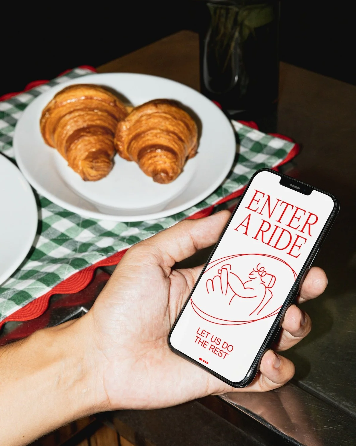
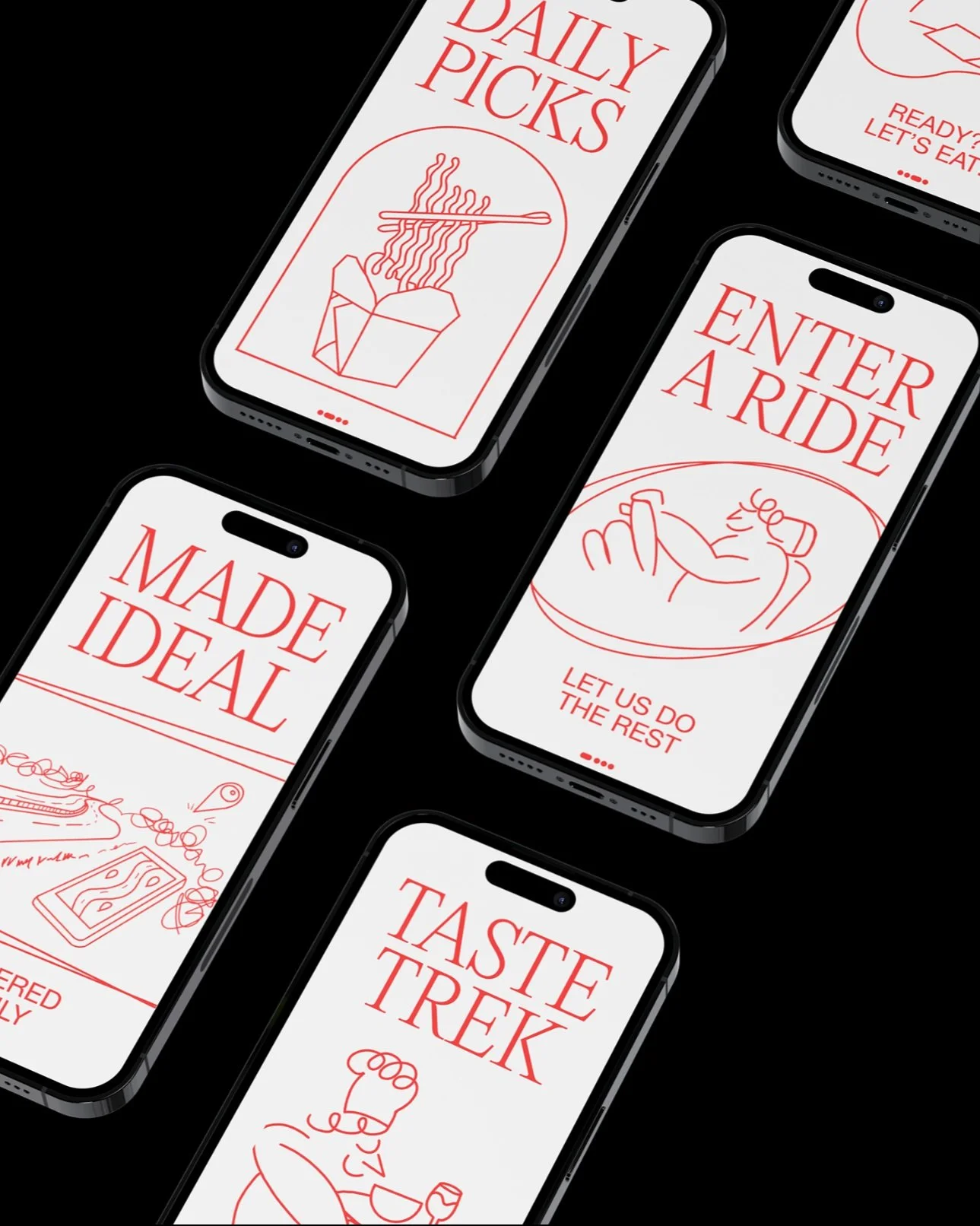
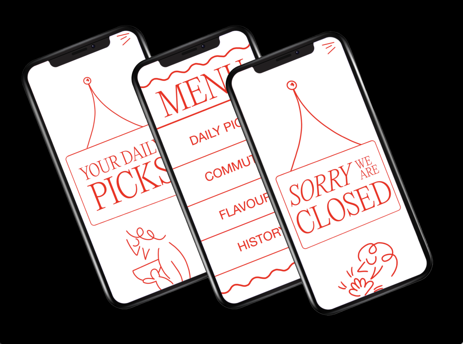
Onboarding
Users are greeted with quirky and unique features such as
illustrations, and also abstract shapes which evoke a lively tone as you enter TasteTrek.
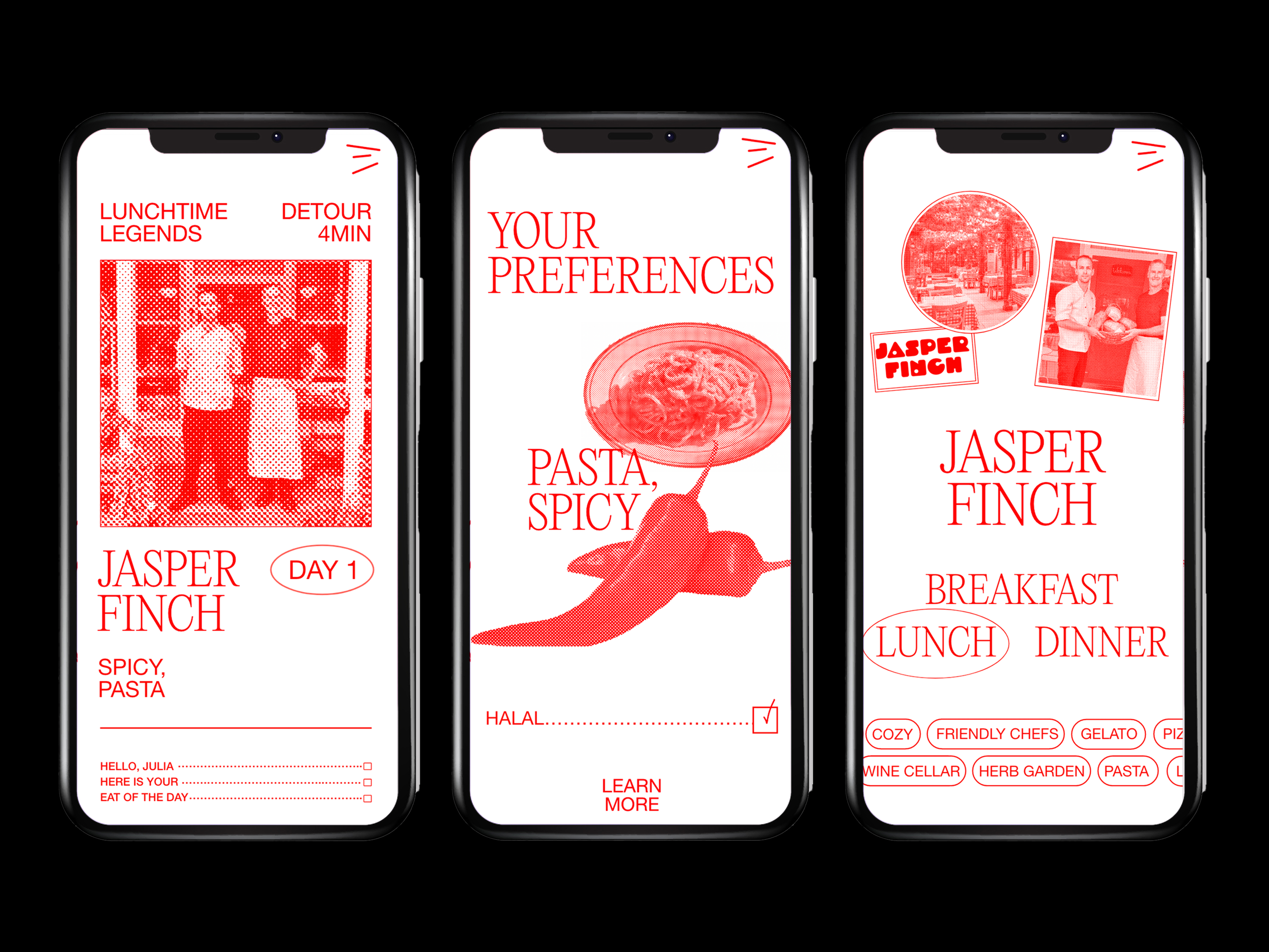
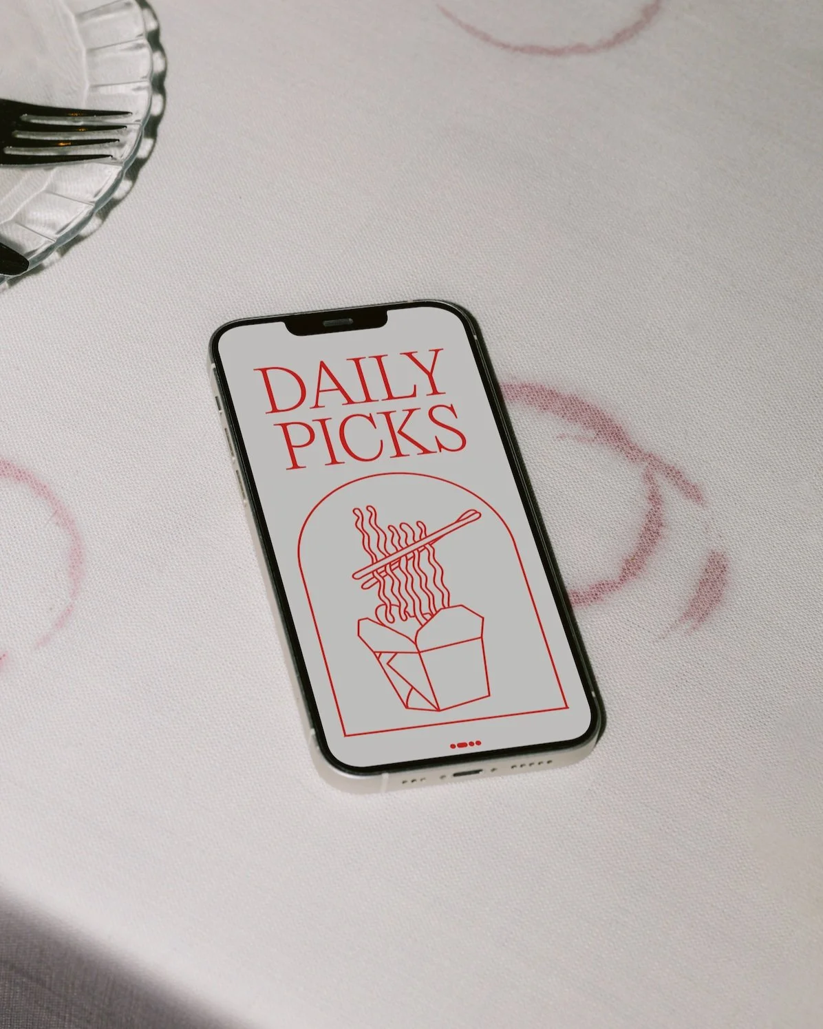
Main Feature
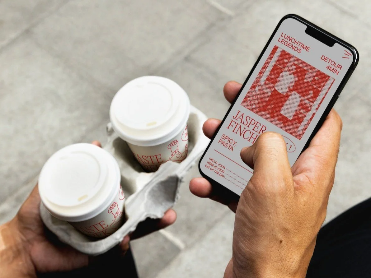
The main feature of the app is the reveal of your daily pick. The menu imitates the format of a receipt or docket. Images are two-toned + bitmapped.
The tap-through discovery page will uncover your daily eatery that aligns with your preferences, time of day, the detour of the route, and also reviews and personal anecdotes and comments from the chefs and the owners. This personalised feature separates TasteTrek from competitors.